Then came again the annual Lifeskills Camp in 2011, and all of us Art Elective Programme (AEP) students were required to design logos for the Lifeskills Camp for our own level, and honestly, I really dislike doing the logos every year. They can be boring in the sense that they have to cover a certain topic and it's always about some sort of leadership inspirational thing, and it can seem a little cheesy. But nonetheless, I still did it anyway as it accounted for part of my marks... My lack of enthusiasm may have cost me though, as I wasn't very thrilled to be designing the logo. The theme of the camp was "Discovering Self, Venturing Beyond", and we all embarked on our individual journeys.

The concept of moving into the horizon was what I was going for, as well as the idea of moving upwards/forwards. I also wanted to do something that had the fisheye effect but I wasn't the most keen on that idea and I decided to abandon it. I tried to use some of my (limited) artistic experience to help me in this project. I referred to two Romantic artworks, one being the Wanderer above the Sea of Fog by Casper David Friedrich,
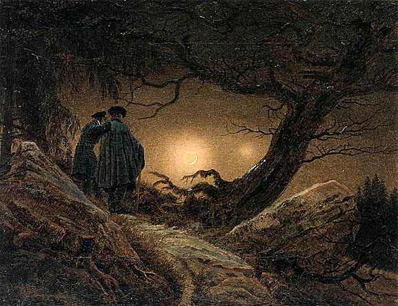
and the other being Two Men Contemplating the Moon by the same artist.
I chose them as I wanted to portray that same feeling in the logo of the character looking far and looking ahead. Naturally, one way to portray that would be to portray the character facing the back, looking into a seemingly limitless distance.
Below are my drafts. Of course, i had other designs, but this was the only idea I felt so strongly I wanted to do above the rest.

To the left is the photoshopped version of my draft scanned into my computer. After which, I started to play with the different colour combinations, and determine which one would bring out the message clearly. However, later on, I was informed by my teacher that he wanted a black and white version of our design, so I had to scrap the idea of colours. Later on, we all gathered together and the teacher got us to evaluate each others' designs and I received quite a bit of feedback from my peers. Let me now explain my design a little, just in case it you may not fully understand it. When seen from the big picture, the obvious image is the keyhole, which is meant to show the triumph in unlocking something, thus linking to the concept of "Discovery of Self". The nails of the key hole (the circles with Xs on them), are supposed to represent the hands of the girl figure which is represented by the keyhole itself, as if throwing its hands up in a celebratory manner, but it was this I was criticised for as someone pointed out that the Xs seemed to give the logo a negative connotation, and thus it would cause my logo design's concept to backfire. I was pretty glad for honesty in bringing me feedback though :) and I decided to change it afterwards.
Upon zooming in, one can see the figure climbing up the ladder, and the fact that it's climbing out of a "dark hole" shows the figure venturing beyond. The ladder was also altered to have an arrow at the end, such the process appears continuous instead of just having a harsh stop at wherever the ladder would end. The figure was also facing its back to us, so it gives a sense of being forward looking! Anyway, I was told that another improvement I could make was to add in text such that the logo design could be better understood.
So after amendments and changes, here is my final design!
Logo Design for LSC Tee, Photoshop, January/February 2011
Much nicer than the draft piece, don't you think? :)


HELLO JUB!
ReplyDeleteSEXY BLOG :D
haha and omg you wrote so much :O
-Kim
LOL thanks :) i just figured out how to link yay! :) sorry i'm a bit slow D:
ReplyDelete