Saturday, January 7, 2012

Writing 01: Singapore Biennale 2011

We went to the Singapore Biennale at the Old Kallang Airport and this was a very different experience compared to other art exhibits, being in a completely different setting as compared to established art museums in Singapore like the Singapore Art Museum (SAM) which incorporates very sleek and modern design in its interior design whereareas the Old Kallang Airport was left just as it was as the exhibits were supposed to be very site-specific. Also, the type of artworks being shown in the Biennale were rather different compared to the usual things, which would often be paintings after paintings, all on a 2-dimensional scale, and the biennale offered a fresh perspective, in which most of the artworks were on-site installations of great variation. However, I found that installations were much harder to interpret compared to paintings or drawings, and thus this may have affected my interest in the artworks, and it did not leave much impact on me (truthfully and personally speaking).Over here, I am only going to post in here which exhibits I truly found more intriguing or those I liked :)
Firstly, I wanted to talk about this exhibits were giant rolls of paper (2 storeys high) and wire were just stacked next to each other. Although no strong message came to me concerning this exhibit, I liked the spaciousness of it, the way it seemed to maximise everything, and almost making me feel like I'm in a world of giants.
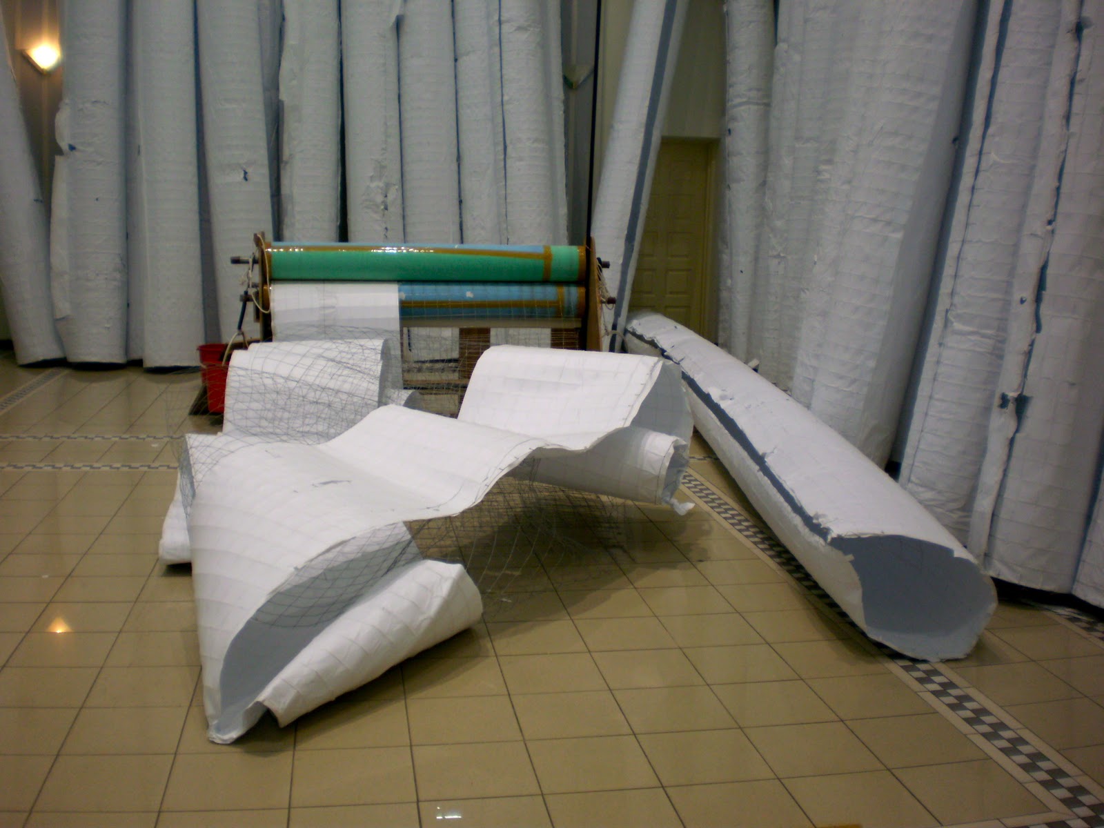
Ok, but I didn't understand the paint cans at the side, but they made nice pillars :) Ok, just joking though :)

Another art installation that I liked was this:
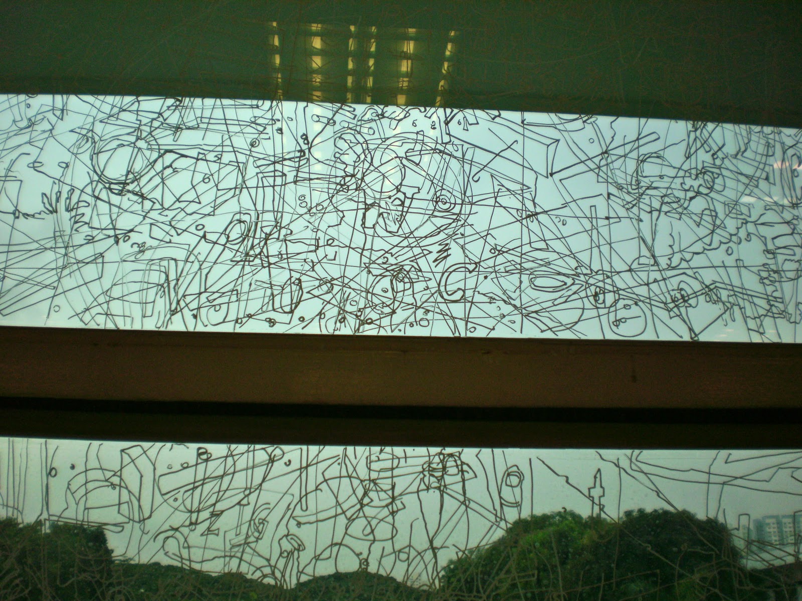
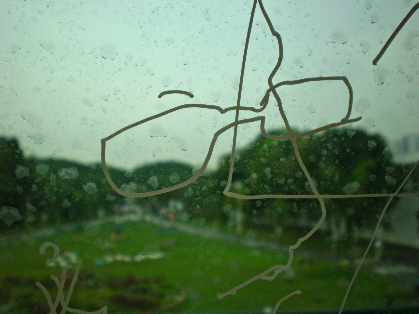
Within, 2008, Gosia Wlodarczak
So basically what the artist did was to sit in the room all day for seven days and use liquid corrector to draw on the windows whatever she saw, creating a dense web of random objects and persons outside the window. The artist called the drawings 'frost drawings', which would somewhat permanently keep the moments on the glass such that it coexists and interacts with the ever-changing world outside of the glass.
Don't Worry, Martin Creed
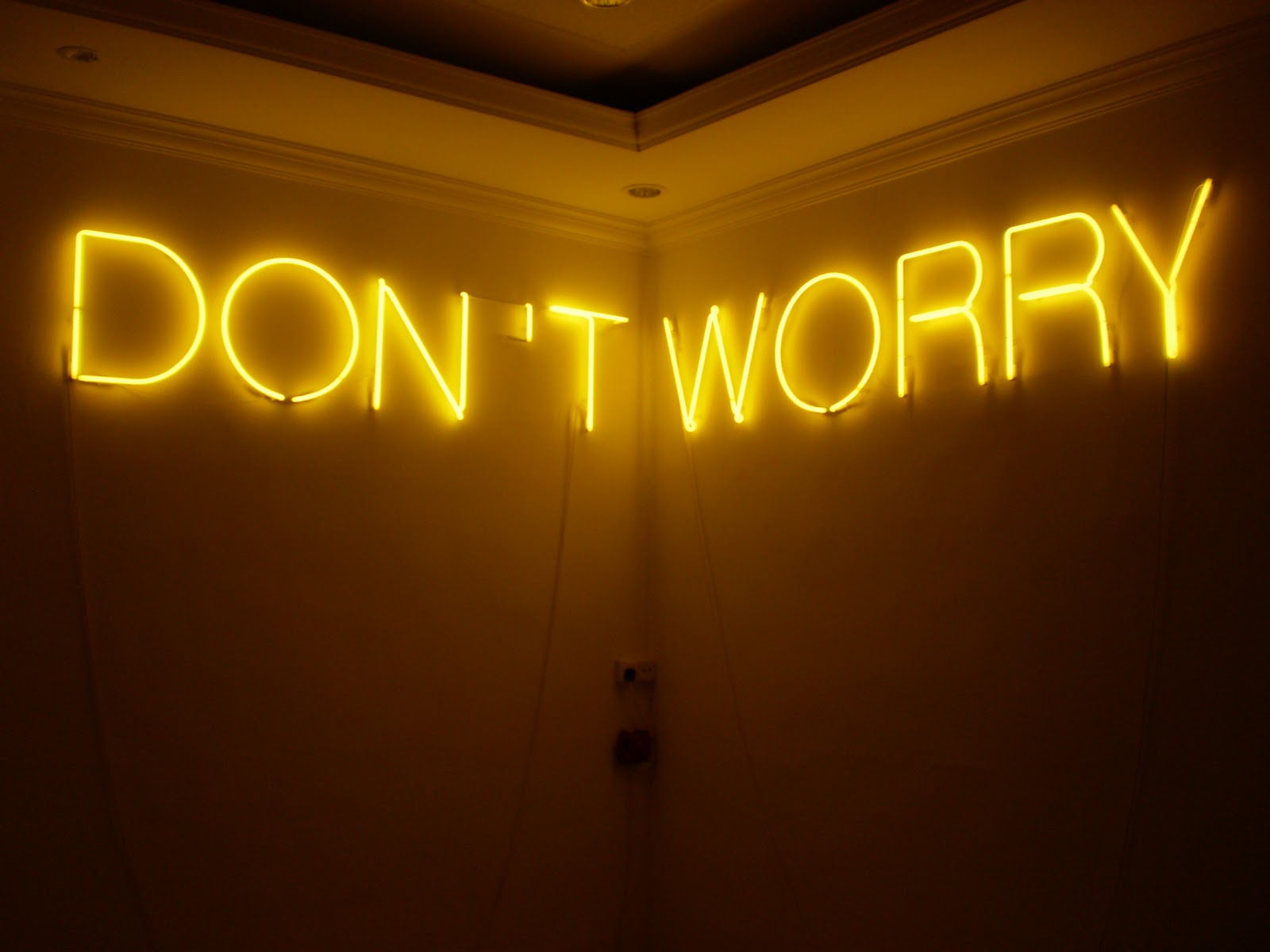
The next exhibit I want to highlight is this Don't Worry signage made of the flourescent lights. It was one of my favourites because of the way it was being portrayed. It was in a dark room, and this was the only source of light, other than the flash cameras clicking away. The words as well as the dimmed lighting made the atmosphere in the room seem so calm and it was almost therapeutic. The concept was so simple and minimalist, yet it had great impact on me, and that's what I often like to go for in my own artworks :) Also, it had a rather positive hint to it, with the light being yellow, like a ray of hope in the midst of darkness. So that was probably what appealed to me about this installation.
However, when I went back, I suddenyl thought about it and did a little reserach on this artwork and I found this:

"The still air, stuffy environment, dingy setting, confined space and the fact that I was alone lends an isolated and lifeless ambience to the room, causing the atmosphere to turn claustrophobic. Needless to say, I wanted out. Assuming that the two doors positioned right next to the artwork was the way out, I made my way towards it.
However, upon closer inspection, I realized that of the two doors, one had a “No Entry” sign, whereas the other one was locked. This heightened my anxiety and claustrophobia, I felt trapped! Suddenly, Martin Creed’s omnipresent voice of a Saint whispering “sweet words of encouragement” is given a whole new evil twist. With the stifling heat making its presence felt by the minute, it was as if Satan has finally bared his true colors, seducing one into the depths of Hell with his sultry words.
Evidently, I managed to leave the room unscathed (by going out from where I came in). Nonetheless, I went through a range of emotions in that room: from the initial sense of calm and liberation, gradually shifting into claustrophobic calamity. This makes the experience exhilarating and special. Just about anybody can enter the room, sneer at the artwork, question its artistic value, proclaim “Even I can do this” and leave in a matter of minutes. The issue that Creed’s “Don’t Worry” subtly highlights is the importance of interaction between an artwork and its audience, in order for any concrete understanding to come about. Rather than being too quick to judge, why not take time to explore the artwork and see if you can make any resonant meaning out of it? Only when a connection is forged can appreciation or the ability to critique an artwork occur, and sometimes it takes awhile for this connection to take place."
From: http://ohnotebook.wordpress.com/2011/04/27/when-words-spell-irony/

Wow! I read this and realised I had missed out on such a big detail of the artwork and I had missed out on one of the big points of the artwork. But looking back, I really do agree with this writer about her own take on the doors and its relation to the words of 'Don't Worry'. I truly truly agree with the ast two sentences she wrote: "Rather than being too quick to judge, why not take time to explore the artwork and see if you can make any resonant meaning out of it? Only when a connection is forged can appreciation or the ability to critique an artwork occur, and sometimes it takes awhile for this connection to take place." 
I do regret not having taken the time to explore this exhibit...

In conclusion, the biennale offered an atypical view of art to me, but honestly, none of it really inspired me as I could not find much connection between me and the works. I mean, usually things only have a big impact on you if it really does pertain to you or has a great deep meaning, but in this case, they didn't.  However, I have also learnt that through observation, not merely looking, can really change a lot of things and even challenge you; to appreciate, one must understand, and to understand, one also has to observe.

Thursday, January 5, 2012

Random: Stationery Doodle

So last year, I was getting a little obsessed over the thing about doodling my original graphic design pattern and I started to do it on my stationery as well... I started it on my scissors first and then my stapler but then again usually when you do something on a whim, it's really nice the first time round, but consequently, it just goes downhill so I was pretty sad. So here are the pictures! Just wanted to share it :) Nothing much about it.
Graphic Design on Scissors, Permanent Marker, July 2011

Graphic Design on Stapler, Permanent Marker, July 2011


Of course it didn't last though... it was permanent marker but it got scratched off anyway... and I lost the scissors :(

Experiential Learning: OM 2011

Last year, our costumes for OM, as our group had decided, we wanted to use a medium other than wire as using wire was not only tedious, we got many cuts from it :( We then started to develop our ideas for our costumes and the idea of using cloth to sew our costumes was much more appealing than other ideas which could have involved more troublesome methods. Having greater experience in sewing, I was then appointed to start planning the costumes for the individual characters. I started off by randomly playing around with cloth on the mannequin. As we were going for the theme of fairytale characters, I had to make the outfits look almost princessy. As you can see in the image of the blue skirt below (meant for Snow White initially), I experimented with a simple draping style, and it turned out really beautifully, 
although it did remind me more of Sleeping Beauty... But it still looked really pretty because of the shade of blue as well, along with the shine it has in the photo. As for the second photo, it is a closer look at the skirt from the front (the drapery was at the back), in which I also tried to do some pleating, but I found that that sort of detail also would not be easily appreciated by the judges in OM. I mean, it's understandable since what they look for is things on a bigger scale, and tiny details are cool but it wouldn't be helpful in scoring us points. 
For the rest of the designs, I was not using the actual cloth for the costumes, only for experimentation.
As for the next skirt which was for the Fairy Godmother, she was supposed to be a serious character, so I created a less playful design for her - one that seemed more analytical and serious. 
The geometric design of the skirt, as I would have liked to think, brought out that concept rather well. The geometric elements would make the character seem more calculative and more solemn in a way, maybe a little more uptight as well? However, this rigidness just wasn't my style and I didn't really like it, but then again, this design was for the sake of the character, not for my own satisfaction.
The next costume I planned for was the Cheshire Cat.
This time, I did something I usually wouldn't have. I did a poofy skirt :O
I just did more of the same drapery I did before, except in a repeated pattern, and unexpectedly, I had created something I found really pretty and I was really really satisfied with it. However, I took it out after a few days, wanting to experiment more with other designs, but nothing else came close to this and I tried doing it again.
However, in my second attempt, the skirt become more rounded, and I tried to figure out why, but I could never find out :( Anyway, later on we changed our script a lot and so did our characters. Nonetheless, I was able to employ this last design to use for a new character, Alice from Wonderland. Back then, my sister was doing this project and I learnt from her (she is taking a Fashion Design course) how to do these poufy sleeves and I started to use the sewing machine again, as well as doing hand-sewing as she needed much help doing this project. It from here that I really started on real sewing of whole outfits (previously I only sewed clothes on a miniature scale). I started to take measurements of each of my friends and I used cloth chalk to draw lines on the cloth and it was a self-learnign experience. I had no help in learning how to do the costumes, but I just relied on God and my imagination to do so. Well, but thank God! I managed to pull it all off and the costumes were all sewn nicely and they looked really good as well! We didn't take pictures in our first performance at the national OM competition but we did during our school's Festival of Arts performance, so here are photos of us backstage...
 In this photo (Names of Characters- left to right):Queen of Hearts, White Rabbit, Cheshire Cat, Alice, Tweedledee, Mad Hatter, Tweedledum
As you can see in the photo, Alice's costume consists of actually two pieces, a top and a skirt (the same design from earlier). For the top I put in poufy sleeves and it actually had long sleeves before, but as I had miscalculated and since the material was unstretchable ,my friend's hand could not fit into it :( So I had to cut it off, leaving only the sleeves.
As for Tweedledee and dum's characters, I only had to sew the pants so not much work needed to be done for it. The top was from old pajamas and our OM tees (worn inside). As you will be able to see later in the following pictures, Tweedledee (the one with the shiny green pants) has other random accessories like the red "tie" and the purple ribbons but those weren't sewed on by me but by my friend :) and those were from the scrap cloth from the Queen of hearts' costume, so that we would not be wasting material.
For the White Rabbit's costume, it consisted of a vest (made and recycled from our old school uniform) and a top belonging to my friend and more scrap cloth to form a tie, as well as purple pants, which were initially similar to Dee and Dum's but it was later altered :)
As for the Queen of Hearts' costume (below), her skirt is very special as it is 360 degrees around and can be opened up, which was the whole idea of having such a skirt for her during the performance. As for her top, I sewed her a cloth corset and she wore it over a white long sleeved top.
 When opened up, it looked like this:
I know it can be a little hard to see but the each panel of her skirt was supposed to be a heart shape. We used the iconic colours of red and white in her costume to carry across the message that she was the Queen of Hearts.
In this picture above, you can see the Cheshire Cat's costume clearly, and it consists of a skirt, top and a jacket. The skirt was also sewn from scratch and the idea was to have it translucent so that the character would be more playful (of course wearing shorts and tights underneath), but that idea wasn't very obvious as you can see... But the details were more important. To show that she represented the Cheshire Cat, I sewed stripes onto her skirt, though not all the way from bottom to top or the design would be too boring, and added pleats in it so that it would flare out. Also ,the "jacket" had feathers in purple and pink being glue-gunned onto a black long-sleeved top in stripes which was then cut to form a jacket.
For the Mad Hatter, I only did the gold jacket which was initially meant for the White Rabbit but it was changed for the better when the Mad Hatter wore it. It also used poufy sleeves and was meant to take after a tailcoat where the front was short and the back was long, like this:

In conclusion, getting to sew most of the costumes, enabled me to gain experience in sewing. Before this, I didn't care about planning for the things I was going to sew or taking measurements or being accurate, but now I am certainly more confident of my sewing skills and it is going to be an essential part of my Coursework this year. It really was the process of this that mattered so much, learning rom my mistakes and I really thank God that the costumes came out with such success and almost no difficulties! 
 :)

Things I can take credit for: Alice outfit, Cheshire Cat skirt, White Rabbit pants and vest, Queen of Hearts outfit, Dee and Dum's pants, Mad Hatter's golden coat

Experiential Learning: January to April 2011

Wednesday, January 4, 2012

Artwork 02: Design for Class Tee 312'11

Being the only AEP student in my class, I was pushed to do a design for the class tee. Not really complaining, but it's usually the case when you have AEP students in the class :) I was doodling when I did this, and I started to do some graphic design-like patterns, and at first I wanted to do these big angel wings at the back of the tee but I was later told that the t-shirt printers charged by the size of the design to be printed (by sheets of A4 papers), so if it exceeded the surface area of an A4 paper, we would have to pay even more and it could cost us a lot of money, as we were trying to keep under the budget of $20 per person. I then changed the design accordingly. I moved the front design to the back and started to brainstorm for ideas for the front. For the back design, initially I wanted to place all our names inside the design in the form of '312' (my class) but I couldn't do it in the end as the t-shirt printer told me that our names would be too small for the printing. Below is the design with our names and I'm sure you'd agree it's prettier than the one without :) 
So this is the final design on the actual tee :) for the back, at least.
Design for Back of 312 Class Tee, Photoshop, February/March 2011

As for the front, I found some bohemian print photoshop brushes and this easily solved my problems, and it was finally complete! We also managed to stay under budget :) 
Design for Front of 312 Class Tee, Photoshop, February/March 2011

Personally, I don't really love my design (i'm just ok with it). I think I was more worried about having to please the tastes of my classmates rather than really expressing myself in it. It's not the most fantastic design, but I do find it rather original, and it has sort of become a bit of a trademark for me, although I'm not that keen on graphic design. I think the constrictions imposed on me (in this case the stress i felt having to please my classmates) sometimes just puts me off, likewise for the LSC logo I showed you guys in the previous post. It makes me feel compelled to do something against my own will, especially if it carries no meaning for me. This has taught me something that for Coursework this year, I have got to choose something that really means something to me, something special, otherwise I'd probably lose the passion or doing the Coursework and lose the motivation to do it altogether. I guess most of the time actually the process does matter more than the final product itself :)

Artwork 01: Logo Design for LSC 2011

Then came again the annual Lifeskills Camp in 2011, and all of us Art Elective Programme (AEP) students were required to design logos for the Lifeskills Camp for our own level, and honestly, I really dislike doing the logos every year. They can be boring in the sense that they have to cover a certain topic and it's always about some sort of leadership inspirational thing, and it can seem a little cheesy. But nonetheless, I still did it anyway as it accounted for part of my marks... My lack of enthusiasm may have cost me though, as I wasn't very thrilled to be designing the logo. The theme of the camp was "Discovering Self, Venturing Beyond", and we all embarked on our individual journeys.

The concept of moving into the horizon was what I was going for, as well as the idea of moving upwards/forwards. I also wanted to do something that had the fisheye effect but I wasn't the most keen on that idea and I decided to abandon it. I tried to use some of my (limited) artistic experience to help me in this project. I referred to two Romantic artworks, one being the Wanderer above the Sea of Fog by Casper David Friedrich,
and the other being Two Men Contemplating the Moon by the same artist. 

I chose them as I wanted to portray that same feeling in the logo of the character looking far and looking ahead. Naturally, one way to portray that would be to portray the character facing the back, looking into a seemingly limitless distance.
Below are my drafts. Of course, i had other designs, but this was the only idea I felt so strongly I wanted to do above the rest.
 To the left is the photoshopped version of my draft scanned into my computer. After which, I started to play with the different colour combinations, and determine which one would bring out the message clearly. However, later on, I was informed by my teacher that he wanted a black and white version of our design, so I had to scrap the idea of colours. Later on, we all gathered together and the teacher got us to evaluate each others' designs and I received quite a bit of feedback from my peers. Let me now explain my design a little, just in case it you may not fully understand it. When seen from the big picture, the obvious image is the keyhole, which is meant to show the triumph in unlocking something, thus linking to the concept of "Discovery of Self". The nails of the key hole (the circles with Xs on them), are supposed to represent the hands of the girl figure which is represented by the keyhole itself, as if throwing its hands up in a celebratory manner, but it was this I was criticised for as someone pointed out that the Xs seemed to give the logo a negative connotation, and thus it would cause my logo design's concept to backfire. I was pretty glad for honesty in bringing me feedback though :) and I decided to change it afterwards.
Upon zooming in, one can see the figure climbing up the ladder, and the fact that it's climbing out of a "dark hole" shows the figure venturing beyond. The ladder was also altered to have an arrow at the end, such the process appears continuous instead of just having a harsh stop at wherever the ladder would end. The figure was also facing its back to us, so it gives a sense of being forward looking! Anyway, I was told that another improvement I could make was to add in text such that the logo design could be better understood.
So after amendments and changes, here is my final design!
Logo Design for LSC Tee, Photoshop, January/February 2011

Much nicer than the draft piece, don't you think? :)

Welcome!

Hello readers, this is my art blog I'm supposed to keep for a long-term project this year and it will include pictures and posts of my artworks, writings, inspirations and other stuff. I'll start off firstly with my artworks from last time :) and as I progress into the art project I will keep you updated! :)