Wednesday, August 22, 2012

Random: Dance as art.


I watched this video sometime back, and it made an impression on me being a dancer, and I thought their use of light while dancing was quite fascinating. Though not the most original idea, but like TED says it's an idea worth spreading. It has opened my eyes to the effect of light in video and etc. It is not merely for lighting up the stage: it can be part of the stage, creating visuals like never before.
Take a look!

Random: Tumblr Artist

Illustrations by Katie Faulkner on Tumblr


I came across these images while surfing on Tumblr, which really has many extraordinary artists, and I was taken in by the simplicity of the line art. Although I probably would not want to emulate it due to its tedious nature, I really like the graphic design the artist has used. As seen before in my previous blog post,
it really appeals to me, and surprisingly I think my doodle was slightly reminiscent of the work. 
I also like the fact that the artist did not use lines to directly show the form of the animals, but rather the form is implied by the use of positive and negative space very smartly.

Writing 07: Les Valeurs Personelles (Personal Values)

Les Valeurs Personelles (Personal Values), Rene Magritte, 1952

In Personal Values, the objects are everyday objects from Magritte's own room and are actually very ordinary objects that we may observe to be in our own rooms as well, except the appearances of the objects may be different due to the development after time. On the left hand side there is a bed in the corner of the room while a giant comb stands upright on the bed while leaning against the wall. Adjacent to the bad is a matchstick laid on the carpet. The central focus almost seems to be on the glass cup which is in the middle of the room. On its right is a pink soap and behind the soap is an armoire with a mirror, which happens to reflect the insides of the room as well as a window which has not been depicted in the actual room, only in the reflection. On top of the armoire is a brush, seemingly for make-up.
Magritte has used the colors wisely. The cool colors are juxtaposed directly next to the warm colors, forming a greater contrast within the painting, as well as falsely creating an effect to make the colors in the painting brighter, also needed as it is hinted that there is an open window through it's reflection in the mirror. He has also used the juxtaposition of the curved edges of the objects against the rigid and angular. One prime example is the one between the curve of the back of the comb and the bed frame, as seen here:
Other examples would be the curvature of the cup against the edges and plank-like rigidity and stiffness of the armoire. These contrasts then bring a certain life into the painting and truly making it appeal more to the viewer.

Also, all the objects are blown up out of proportion and are larger than usual, and are placed alongside one another, but the composition has been planned such that they also do not overlap each other very much. This allows the objects to be seen as individual entities rather than being piled together to be seen only as a whole. This planning of position strategically allows them to carry separate deeper meanings to each object as compared to only one singular meaning from the big picture. It also induces the viewer to really look deeper into the painting as they have to analyze the objects one by one.

Now deconstructing the painting step by step, we will first look at the objects, individually, as possibly hoped for by Magritte. Starting with the armoire, it is somewhat a representation of personal grooming and presentation to the public world. This is highlighted through the use of a mirror on the armoire which is often and always used by people to check and evaluate their own appearances as "socially acceptable" before even appearing in public. The fact that an armoire is used to store clothes further highlights this personal check of outer appearance for public view, as the clothes and the dressing would be the very thing to speak volumes about them in public. This idea of public appearance is reiterated once again where the soap and the brush in front of and above the armoire respectively are concerned with public appearance. They are both items of personal grooming and beautification. The very clash of public versus private gives a slightly cornering feel to those who would view their bedroom as their personal space and almost a sense of intimate belonging, where one actually need not to glamorize themselves by grooming themselves with the objects in the room. It is in short, simply a representation of one's private (possibly even most private space) area in a bedroom or even a house. Then again, the grooming objects are so greatly blown up that they cannot be avoided despite being something that is supposed to be overlooked in a comfort zone and space where one need not be presenting themselves in a conformed way to the outside world.
The bed itself is another representation of one of our most intimate spaces where we are safe and sound, where we can rest. However this rest is disturbed by the idea of being constantly judged by the outside and thus the need for grooming again. This is shown through the use of the comb being placed uprightly on the bed as if exuding a seemingly uncomfortable feel in an uptight manner where even the comb blown up to human-sized proportions refuses to lay on the bed to truly rest.
Yet another interpretation of the bed and the comb's relationship would be in relation to the hair. The comb is used to groom specifically one's hair and yet the comb is being placed closely to where one would be resting their head on the bed, almost also indicating a slight mental/internal struggle (in relation to the head). This would be one of the more specific examples pertaining to the struggle between the private and public.

Other than the idea of struggle between the public and private space where in this case the public space is starting a silent invasion into the private quarters of a person's mind or literal private space, there are also some other seemingly random concepts.

For example, the matchstick on the floor is also has a hint of sexual connotation. The matchstick is presumably placed in close proximity to the bed, which is supposedly sending an intentional pun in the message of  'you turn me on'. There is yet another sexual connotation in regard to the wine glass placed centrally in the room. It is meant to be hinting at the sinuous and curvaceous shape of a woman very slightly. The fact that such a hint at the female figure is being placed in a bedroom setting makes the wine glass seem all the more with a sexual hint to it.

Also the sky itself is another smart juxtaposition which Magritte has incorporated into the painting. The sky is always something we see as a symbol of freedom, and always what we see outside of our rooms. However, in this case, the roles have been reversed where the sky is seemingly contained as a mere wallpaper in the room, only to be extended in space by the reflection in the mirror. It gives a sense of sudden constriction to what we usually see as endless and free. This is further explained below.

This depiction of the room can be seemingly harmless to anyone, but on re-contemplating its meaning, one can actually detect a certain insincerity to the painting's assumed innocence. It is actually a painting so subtly sinister and almost eerie. The room is filled with familiar objects,  but with their now dominating presence as large objects in human proportions, it confuses the viewer and gives a sense of ominous discomfort. It is as if the room turns cold being so overwhelmingly devoid of human presence and yet so strongly prevalent with the cold lifeless objects. Furthermore, with the way the objects are arranged, not overlapping (as mentioned before), it gives an almost confrontational feel as if issuing a direct challenge to the viewer and it seems almost threatening in a way. Even the very thing we seek comfort in, familiarity, is challenged. What is supposed to be within or outside of a room is also inverted; the wallpaper is one of a sky which is supposed to be the endless scene outside of the room, yet it is contained, and one is unable to determine what is outside of the window or room as it has not been painted into the artwork. It gives a sense of mystery, further disorientating the viewer. Normality is no longer able to even take a step into this painting at all. As quoted from a website,
"Magritte creates a paradoxical world that is, in his own words, "a defiance of common sense." "(SFMOMA, 2012)
This sums up the very essence of this painting. Obviously then, Magritte has been successful in putting across his message in the painting, doing it slyly and subtly yet so strongly.

Own Personal Values Room

Personal Space, 2012

Rather than naming the work personal values, I have chosen to call it personal space instead. It is meant as an intentional pun on the phrase 'personal space', i.e. like a space with my personal belongings as well as my mental personal space. This is because this work is really about what comes close to my heart, and in contrast with Magritte rather than using the objects to reflect some sort of social issues, my work is mainly albeit not wholly about myself, for a time of having my personal space. Also, I chosen to use the scale not to intimidate but in a way to emulate his work as well as use it to show the importance of the objects.

I will now explain the significance of the objects. Starting with the compass, it is actually a gift from my primary school teacher, and I remembered clearly how he told my class that it was a representation for us to find our way in times where we lose ourselves. As a primary school student, emotionally or mentally I actually did not have to deal with much, but recently I had just lost myself so badly that I had changed from who I was, my usual joy and happiness became tears and being self-absorbed etc. And trust me, it wasn't anything about puberty doing its work. However, when I dug it up again for this assignment, I really started to question myself as to who I really was and what I had changed into. I knew very well that I had changed and lost parts of me, but I didn't know in specifics what they were. For this reason, it is one of the objects that had been blown up in a relatively big scale, for it reminded of something that should have been more important in my life: keeping my self-identity.

The basketball in this picture is actually just a rather literal representation of my sudden interest in basketball. I picked it up more passionately than ever in the past few months (I had been trying out shooting some hoops in sec 3 for fun) but now I find myself wanting to play it a lot more and I'm willing to do it more seriously. I guess it's just like one of those random hobbies. However, it has been a hobby that I have dedicated myself to more strongly than others, also because I'm a very active person it serves as an outlet for my energy XD Then again, it became closely linked with someone special in my life and I guess that was one of the reasons why I pursued it more consistently than other passions.

Next to it is actually an orange bracelet. This bracelet actually symbolises for me the same special person as when I was talking about the basketball :) For some reason, it always reminded me of that person, which is why I decided to keep it close to me, as I didn't want to forget what precious memories there had been. In the time I made this artwork, I actually made it in a small scale as compared to everything else, was actually because it was depicting my inner struggle. I was trying my best to forget about that person having gotten somewhat hurt, yet I didn't exactly want to let go. As a show that I hoped to forget, in the artwork I actually downsized it, trying to almost disregard or sideline it in a way. However, the very irony here is that it has even been placed in the artwork, which would actually remind me of its importance. This irony is further shown through the fact that it has been placed centrally, almost leaving it as a subtle focus of the work.

Right behind is actually a card from my dance senior, but more importantly was the message on the photograph printed :) It says "NYMD: A family of dancers not made of their technique but their passion". NYMD actually stands for Nanyang Modern Dance, my CCA, which really had uncovered my passion for dance in the past four years of being in this CCA. Dance has been incorporated into almost every aspect of my life, be it just walking, talking or anything else I do HAHA XD NYMD itself has become a second family to me and I know how true that statement is. Every single word of it. This appealed even more to me being the the only dancer in my batch who entered my CCA with no dance background. This made me struggle a bit at the start and use to feel rather excluded as I would not be chosen for performances and such. However, that statement really showed me that hey, NYMD actually is really a very accepting CCA and family of dancers, because in the end, no one gave up on me and I myself had not given up on my passion for dance. It really is our mutual love for dance that pushes on to strive to be better dancers. The technique really had to come second to our love for dance. Looking back at the technicalities in the work, the card is also further highlighted in importance through the bright purple in comparison to the dull or earthly hues of the background, truly standing out in the midst of the other objects.

On the left hand side of the painting, are two objects I am associating with societal conformity, which is the liquid eyeliner pen leaning against the pin mold toy. The hand form being molded in the pin mold toy is almost in a way reaching out to the world in a seemingly desperate cry. Similarly, the liquid pen eyeliner is in a way showing conformity, by looking more socially acceptable through artificial means of make-up. I myself do not really like the idea of conformity, but sometimes I feel that I cannot fight very much against it, especially when you end up losing out if you choose not to conform. This is where my struggle as depicted by the outstretched fingers of the hands. This is in a way also in line with Magritte's using of objects to represent a certain struggle within the work, and they have got to do with society and self.

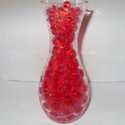
Lastly, I placed in the crystal ball (which is actually a soft gelatine like ball). It is in a way emulating Magritte's composition by placing a somewhat transparent object more centrally in the work, also with a curvaceous edge to it. This object actually represents my childhood memories, as we used have these crystal balls which would absorb water, turning from small seed like forms into these jelly like balls, no bigger than a 1 cent coin. Although they were actually for plants as a form of beautification in the vases, as illustrated below.
We dubbed them as water babies and used to play with them, storing them in used plastic water bottles and often pouring them out and seeing how much they could bounce before they would break. It was not as fragile as we thought. In a way this taught me a lesson, that no matter what, in facing difficulties, we should really just bounce back, otherwise, we would only crash and be smashed. 

In general the entire composition, like Magritte's, I made sure that there was as little blockage of each object's important elements, and despite the differing scales, every single object and it's significance is just as important as the other. Actually, as for the significance of the overall arrangement, there is not much distinctive meaning, but rather I have chosen to separate the most personal on the right end, and the objects pertaining to society and self on the left. I simply choose not to mix them as I prefer to keep the personal and public more separate, and I do not want to allow certain public/other's notions to be invading into my world again, and end up losing myself (thus the compass on the extreme right, representing the most intimate part of me, of soul-searching and self-discovery).

Also I chose to just use a simple cardboard box as background, as I really want to "keep things in perspective" (literally in some way). I did not want to distract the viewer by using other media such as mirror which would cause immense confusion and loss of focus due to the reflections. Since this piece of work is explaining something close to my heart, I also did not want to use anything fancy, not just to cut distraction, but also to be translating my message to the viewer in a more raw and real manner. It is a reminder that what I have been explaining through the symbolism in the objects are in fact from the very depths of my heart and are just simply real.


Sunday, August 5, 2012

Writing 06: Piet Mondrian (The Journey from Reality to Abstraction)

Piet Mondrian developed his own unique painting style over the years, which is truly a journey from reality to abstraction. Let's take a look at a few of his paintings chronologically.
Avond (Evening): The Red Tree, 1908, Mondrian
This picture depicts a red tree against a predominantly light blue background. It mainly uses primary colours, which also offers a great contrast between the colours due to the polar differences in warmth of the colour. The tree is also painted in arbitrary colours, however, it is still distinguishable as a tree and it is still in some ways realistic. The brushwork is also rather obvious and appear almost like they were dotted on the canvas rather spontaneously. The lines created are then also affected by the syncopation of the brushwork; the lines are rather fuzzy and not clear cut. Some of the lines which are branches are more faded than the others, so as to create the effect of the branches being progressively further away from the viewer, implying a 3-dimensionality to the painting, rather than just a flat depiction of the tree as assumed from a glance of this work.
Grey Tree, 1911, Mondrian
In this picture, the tree is has been abstracted and simplified into curved lines. Rather than being a 100 percent realistic depiction of a tree, it is implied through the simple usage of lines, created by the overlapping and branching pattern. This painting is a very monochrome one and employs only different shades of grey, black and white. The brushstrokes are rather carelessly painted on, and it is apparent that in conjunction with the Cubist elements of this painting, Mondrian has also taken care to further this chase of Cubism in this painting by using a square flat-tip brush. Similar to Avond (Evening): The Red Tree, some of the lines are progressively faded to create a slight 3-dimensional effect, but for this painting, it is to a lesser extent. It is less obvious also due to the lower contrast between the tree as the main subject matter and its background. The subject matter has been flattened severely, almost as if to blend in with the background as one instead of a distinctive main subject matter as usual. 
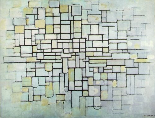
Composition no. ii (Composition in Line and Colour), 1913, Mondrian
This artwork is predominantly done in pastel colours, but bold black lines are painted on clearly to create rectangular shapes, as well as some semicircles in the sea of rigid right angles. Similar to the previous two artworks there is a fade off effect, but this time round it lies not in tree branches but rather it is done as an edge blur in a vignette format. The lines eventually get weaker and lighter as they approach the ends of the canvas. There are visible patches of colour, indicating the slight carefree-ness of Mondrian despite the boundaries set through the boxes in the painting. 
Composition with Large Blue Plane , Red, Black, Yellow and Grey, 1921, Mondrian
 This painting consists and is formed by flat planes of colours encased and bounded by simple black lines which form boxes as they cross each other systematically. The colours used are also not very varied, but rather of simply primary colours, black and white, as well as a very faint grey. They are also placed in such a way that the bright colours are adjacent to the monochromatic hues of white, grey and black. 

One of the most obvious progressions would be that certainly, the subject matter of his paintings became increasingly abstract and simplified down to a more purely 2-dimensional state. Also, the variation of colour eventually became more limited, and he often re-used the same hues for different paintings. Another change would certainly be in the style he painted in. At the start in Avond (Evening): The Red Tree, it had inklings of being Post-Impressionist, taking after Van Gogh's style of using short brushstrokes, predominant in his works like Starry Night. However, in both Grey Tree and Composition no. ii (Composition in Line and Colour), they are most obviously following in the footsteps of Cubism, being flat and having colours of low contrast. 
The role of the colours in his paintings has also changed. Rather than just being accessories to the painting by bringing life into the otherwise dead and colourless compositions, or just constituting the painting, they seem to dominate the painting as individual entities. Gradually, the focus is changed from the subject matter as objects to having the colours themselves as the main point of the painting. The paintings can no longer possibly truly live without colour as they slowly grow more dependent on the hues to make the artwork the artwork. Certainly, the subject matter has changed.

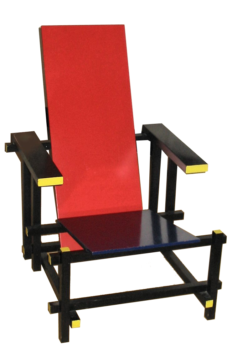
Looking at the wider De Stijl movement e.g. Gerrit Rietveldt's chair...

I personally think that the De Stijl movement did have a certain lasting impact on the design and art. It has in some ways given rise to the popularity of minimalism. This is apparent through the simplicity translating from the De Stijl artists to the equally simple angular forms of minimalist architecture. 
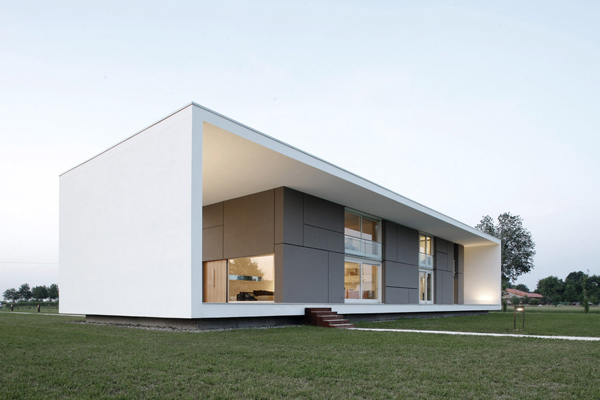
Below are two examples of minimalist architecture:
As one can see, the forms are very straightforward - angular rectangles and geometric elements, devoid of decorative essence. There is little complication to the design.
Also looking at minimalist fashion, 
the designs do not incorporate printed pattern or add ons, but rather it leaves only what is essential and of worth to the design. It is also often single coloured, echoing the flat planes of colour Mondrian used instead of blending colours to form secondary ones. Detail is no longer the focus, but rather the big picture is highlighted.

Ending off with a quote...
"The emotion of beauty is always obscured by the appearance of the object. Therefore the object must be eliminated from the picture."   - Piet Mondrian
Certainly, this statement really sums up my newfound discovery of Mondrian, that the focus no longer lies on what we deem to usually be (an object, a living thing, a person etc.) but rather on what had been making up that subject matter - colours, lines, planes, everything but what had been given the spotlight for centuries.  


Tuesday, July 31, 2012

Writing 05: Reptiles by Escher


Reptiles, Marius Cornelius Escher, 1943 (Lithograph)

Imagine your very drawings your very own work of sweat, tears, and lead coming to life in a span of a second, fulfilling your childhood dreams of seeing things you knew would never come to life do exactly what you never expected it to be - breathe, move and live. Unfortunately this one may be your nightmare more than a fairytale you hoped for; the scaly forms wriggling and writhing out of the paper as if like some sort of possessed animal, clawing it's way around the table. Should it be inciting feelings of disgust, repulse or just plain intrigue?

In Reptiles, the reptiles being the mains subject matter seemingly fuse into and diffuse out of the abstract drawing of the reptiles and travel in a circle around the painting, giving a sense of dynamism and movement, as the viewer's eyes will naturally move along with the direction in which the lizards are traveling in a circular motion. 
This work is one that is almost typical of Escher's style of tessellation and repetitive design. This is obvious through the hexagons being tiled aside one another in the drawing in the lithograph in a routine manner. However, one particular interesting aspect of this artwork is the contrasting of the realistic, 3-dimensional figures of the reptiles against the flat, 2-dimensional drawing of the same reptiles as well as the surrounding . 
Another fascinating juxtaposition is the one of the curvature of certain objects against the rigidity and angularity of the other objects. One such example would be:
(Screenshot of top left hand corner of Reptiles)
As one can see, on the left is a rounded bucket-like object which is obviously one that is curved and rounded on the outside, further highlighted by the circular rings on the bucket itself. Adjacent to it, however, is the angular block which is formed by the pointed shape of the pentagon and that in itself is also a slight visual oxymoron as the shape of the block overall slightly resembles one of a sphere, an obviously rounded object. This is obviously a very strategic and playful composition as crafted so carefully by Escher.
Furthermore, another facetious aspect of Reptiles' composition is the scale of the objects in the picture. Although very subtle and almost un-noticeable to one who does not observe the lithograph carefully. However, upon meticulous observation, one would note that the scale of the objects do not necessarily add up. One of the more obvious examples would be:
(Screen shot of right hand side of Reptiles)
As one can see, the size of the opened book on the top right hand corner does not really coincide with the rest of the objects as displayed in the work. It seems almost minute in comparison to the book which is supposedly not far off from it, which challenges the rules of proportion in relation to the distance of an object from the viewer. This also injects an indistinct yet present sense of surrealism. This is also detected through the scale of the reptile as it looks like a crocodile which we often associate with man-eating and humongous; and yet it is smaller than even a book, and this also has a slight Surrealist tint to it.
Certainly, another surrealist element would be that it is impossible for a drawing to come to life and move around. The closest it can ever to come to being alive would be through our imagination and dreams.

The mood of the work is in general rather neutral at the first impression. It seems almost mundane and boring, also brought about by the monotonous lack of color. This same almost unexciting mood carries on as Reptiles is an artwork which is practically "in-your-face"and cannot be more literal. Artworks that  carry a more obvious tinge of symbolism to it are often more interesting, as they draw the viewer in more to find out about the meaning behind the artwork and thus is more audience-friendly in being interactive not just to the eyes but also to their minds. 
However, at the second look, if one cares to observe again, it is the very subject matter which is the essence in bringing out the subtle playfulness in the work instead. The pure idea that this scene is imaginative already gives a hint of light-heartedness. Also, some humor is brought into the work due to the sudden idea that something that looks so threatening like a crocodile-looking reptile would suddenly appear so small and harmless makes one tickled. It seemingly undermines the danger of the reptile and then causes one to simply brush off and dismiss the potential danger as we often detect when coming in close range to such reptiles in the natural environment. The tension is then eased in the work and allows the work to be, as mentioned before, light hearted.

I will be comparing Reptiles to Sky and Water I.
Sky and Water I, Marius Cornelius Escher, 1938 (Woodcut)

Similarities:
Both works make an obvious use of tessellation and repetition of pattern in the works. Both works are also predominantly and as Escher's signature style shows, are all in black and white. 
Differences:
There is a more apparent use of positive and negative space in Sky and Water I and a greater clear distinction between the black and white as there is little shadowing and the lines are more crisply clear-cut. Contributing to this aspect of difference is also the way Sky and Water I is more 2-dimensional and flat, being illustrated in a simplified, abstract manner as compared to Reptiles while Escher still made use of some shadowing as well as played with 3-dimensionality, in a way chasing realism as well. 
They are also differentiated by the way the composition has been structured. In Reptiles, the balanced composition is achieved in a more complex manner where the weight of the objects depicted faintly give an implied sense of balance where areas in Sky and Water I, the balance achieved in the composition is done through obvious means where both horizontally and vertically they are in some ways directly symmetrical. Even the colors are used obviously in optimal balance. 

Although both are Escher's works, they show different sides of Escher in terms of style and also even their media. 

To end off, here's a video which I found particularly interesting as it is short and sweet yet illustrating Escher's possible train of thought. The beauty of the artwork really lay in its simplicity of concept after all  :)


Thursday, April 12, 2012

Artwork 06: Class Tee 412'12

So this year, for my class tee, I really wanted to design something that the class would be able to appreciate much more than last year's design, and I also wanted to motivate my classmates more, so I decided to add a few motivational messages! But I did try to make improvements to my design this year based on last year's response, and one of them was to include everyone's names on the back of the tee. I came up with three draft designs, and my main idea behind them was that they would make use of the idea of positive and negative space, and it would like a stamp on the tee, so it would be a simpler one compared to last year. 
This is my first design, and i didn't really think it would be very popular with my classmates but I just did it anyway...
The purpose of the face behind would kind of be like a Mulan motif, and making use of the idea of heroism, (female) strength and courage to encourage my classmates. The reason why I had this phrase "we don't give up easy; we will, we will, breakthrough", was because from last year, it seemed as if a few teachers had given up on us because my class was rather different from the other classes in the sense that my class was more relaxed and we didn't seem to work as hard. I think somewhere in the back of the minds of some, we were considered as "failures", also because we were notorious for our ridiculously high Mean Subject Grade for Chemistry at 6++. This is year, however, I choose to believe for change in my class, and I know that we will breakthrough. 
But yes, anyway my class didn't really fancy this design as much as the others. My second design was simple:
Above was the original, but upon request by my classmates, I added in the names at the back and this was surprisingly quite popular.

My third design is as follows:
It was my personal favourite design as I liked the scratched quality of the design and it made it more interesting and more textured. However, my class was torn between the second and third designs and to appease both sides, I decided to take suggestions for the changes I should make that the whole class would be able to come to consensus. My classmates then suggested female silhouettes, and I was rather stumped as the only female silhouettes that I saw when I searched on Google were highly inappropriate, and I decided to go with a fashion theme. The silhouettes would then be of a model walking the runway, and I felt that it would give a pinch of an attitude to the design, and it also suited the unique and differing style of my class compared to other classes.
The design was as follows: 

The photos I used in the design were from somewhere on the Internet but I lost the links to it... will update this ASAP!


Monday, March 12, 2012

Writing 04: Andy Goldsworthy

We did a short project, well, in other words, our own take on Andy Goldsworthy. For me, I incorporated a simple concept of a temporal state, and "using what I had in front of me"at that very time. In a school context, I certainly could not uproot plants or make use of the nature around me, so I had another idea...


Carpet on grass!!! I really felt that this was interesting enough as I liked how the bright red of the carpet contrasted with the natural green of the grass, as complementary colours as well. I also was kind of playing with the words in my mind like the relation of the 'carpet' and the 'grass' and then linking to 'carpet grass'. I found that an intriguing concept, and this was furthered by the idea of the carpet as a man made feature against a natural feature.
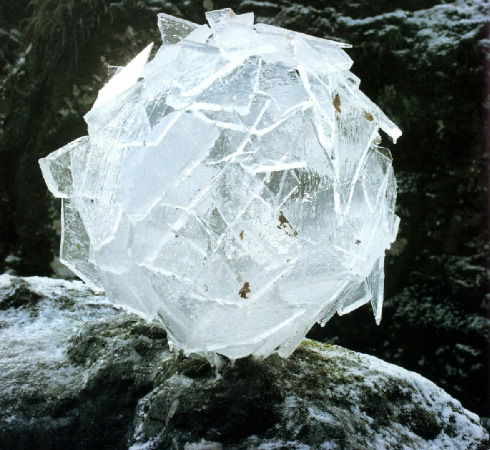
I find this concept of natural versus man-made a concept highlighted in Andy Goldsworthy's work as a well. For example, in this work, 
This ice ball, although made out of a natural element of water, is still constructed through one man's efforts, rather than out of a natural process. In a way, it contradicts itself, by claiming to be an object of nature, but at the same time being something man-made.
Also the concept of being temporal also intrigued me, because I certainly could not leave the carpet on the grass, which was quite sad I have to say because it wasn't as bio-degradable as the ice in Goldsworthy's ice sculptures. That was one of the major shortfalls in my attempt to emulate Goldsworthy's work. His work was temporal because it would later be naturally destroyed, and thus had to be photographed at that precious second in time. However, I had to "destroy" my own work un-naturally...
Personally, I find Andy Goldsworthy's work quite interesting, as it is atypical of what I would usually so-called, define as a piece of art. It opened my eyes to see what art could be , not just paintings or installations, but even further highlighting the process rather than the work itself. It is no longer about the finished artwork, and it can also be just one second of its existence but then again, yes, it can still be defined as art.
To end off, here's a quote that has somewhat opened my eyes a little to the inception of art:
"Not being able to touch is sometimes as interesting as being able to touch." ---Andy Goldsworthy 
Does art truly have to exist only when you're there in that moment? For me at least, no, it doesn't work that way anymore.