Piet Mondrian developed his own unique painting style over the years, which is truly a journey from reality to abstraction. Let's take a look at a few of his paintings chronologically.
Avond (Evening): The Red Tree, 1908, Mondrian
This picture depicts a red tree against a predominantly light blue background. It mainly uses primary colours, which also offers a great contrast between the colours due to the polar differences in warmth of the colour. The tree is also painted in arbitrary colours, however, it is still distinguishable as a tree and it is still in some ways realistic. The brushwork is also rather obvious and appear almost like they were dotted on the canvas rather spontaneously. The lines created are then also affected by the syncopation of the brushwork; the lines are rather fuzzy and not clear cut. Some of the lines which are branches are more faded than the others, so as to create the effect of the branches being progressively further away from the viewer, implying a 3-dimensionality to the painting, rather than just a flat depiction of the tree as assumed from a glance of this work.
Grey Tree, 1911, Mondrian
In this picture, the tree is has been abstracted and simplified into curved lines. Rather than being a 100 percent realistic depiction of a tree, it is implied through the simple usage of lines, created by the overlapping and branching pattern. This painting is a very monochrome one and employs only different shades of grey, black and white. The brushstrokes are rather carelessly painted on, and it is apparent that in conjunction with the Cubist elements of this painting, Mondrian has also taken care to further this chase of Cubism in this painting by using a square flat-tip brush. Similar to Avond (Evening): The Red Tree, some of the lines are progressively faded to create a slight 3-dimensional effect, but for this painting, it is to a lesser extent. It is less obvious also due to the lower contrast between the tree as the main subject matter and its background. The subject matter has been flattened severely, almost as if to blend in with the background as one instead of a distinctive main subject matter as usual.

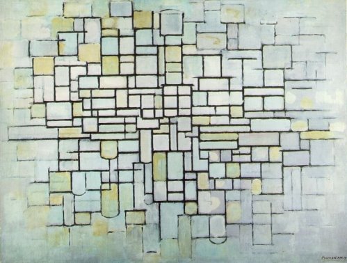
Composition no. ii (Composition in Line and Colour), 1913, Mondrian
This artwork is predominantly done in pastel colours, but bold black lines are painted on clearly to create rectangular shapes, as well as some semicircles in the sea of rigid right angles. Similar to the previous two artworks there is a fade off effect, but this time round it lies not in tree branches but rather it is done as an edge blur in a vignette format. The lines eventually get weaker and lighter as they approach the ends of the canvas. There are visible patches of colour, indicating the slight carefree-ness of Mondrian despite the boundaries set through the boxes in the painting.
Composition with Large Blue Plane , Red, Black, Yellow and Grey, 1921, Mondrian
This painting consists and is formed by flat planes of colours encased and bounded by simple black lines which form boxes as they cross each other systematically. The colours used are also not very varied, but rather of simply primary colours, black and white, as well as a very faint grey. They are also placed in such a way that the bright colours are adjacent to the monochromatic hues of white, grey and black.
One of the most obvious progressions would be that certainly, the subject matter of his paintings became increasingly abstract and simplified down to a more purely 2-dimensional state. Also, the variation of colour eventually became more limited, and he often re-used the same hues for different paintings. Another change would certainly be in the style he painted in. At the start in Avond (Evening): The Red Tree, it had inklings of being Post-Impressionist, taking after Van Gogh's style of using short brushstrokes, predominant in his works like Starry Night. However, in both Grey Tree and Composition no. ii (Composition in Line and Colour), they are most obviously following in the footsteps of Cubism, being flat and having colours of low contrast.
The role of the colours in his paintings has also changed. Rather than just being accessories to the painting by bringing life into the otherwise dead and colourless compositions, or just constituting the painting, they seem to dominate the painting as individual entities. Gradually, the focus is changed from the subject matter as objects to having the colours themselves as the main point of the painting. The paintings can no longer possibly truly live without colour as they slowly grow more dependent on the hues to make the artwork the artwork. Certainly, the subject matter has changed.
Looking at the wider De Stijl movement e.g. Gerrit Rietveldt's chair...
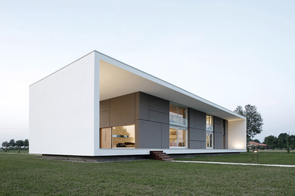
I personally think that the De Stijl movement did have a certain lasting impact on the design and art. It has in some ways given rise to the popularity of minimalism. This is apparent through the simplicity translating from the De Stijl artists to the equally simple angular forms of minimalist architecture.
Below are two examples of minimalist architecture:
As one can see, the forms are very straightforward - angular rectangles and geometric elements, devoid of decorative essence. There is little complication to the design.
Also looking at minimalist fashion,
the designs do not incorporate printed pattern or add ons, but rather it leaves only what is essential and of worth to the design. It is also often single coloured, echoing the flat planes of colour Mondrian used instead of blending colours to form secondary ones. Detail is no longer the focus, but rather the big picture is highlighted.
Ending off with a quote...
"The emotion of beauty is always obscured by the appearance of the object. Therefore the object must be eliminated from the picture." - Piet Mondrian
Certainly, this statement really sums up my newfound discovery of Mondrian, that the focus no longer lies on what we deem to usually be (an object, a living thing, a person etc.) but rather on what had been making up that subject matter - colours, lines, planes, everything but what had been given the spotlight for centuries.