This project took a really long time to do...
Anyway! On to the next thing: from the start.
Firstly, Mr Robertson had already done all these paper patterns in life size like these:

And basically what we had to do was to attach them together by using glue tape, which is basically tape with dried glue on one side and then we have to dip the tape into water so that the glue will become wet and stick onto the surface.

After which, to prevent less tearing and such, we also had to use clear tape to stick over the glue tape.
That was the easy part, just getting it together, but after that, we had to start planning our design and the sketchbook.
Basically, I started brainstorming, and I was thinking that I may or may not use the paper kimono as I was also rather keen on the idea of sewing the kimono/kimono-inpired clothing.
For my sketchbook cover, I will show it later on as I only did at the end when I had finalised what I was going to do. My initial stages of planning started with the research of what I liked, and this was my basis:
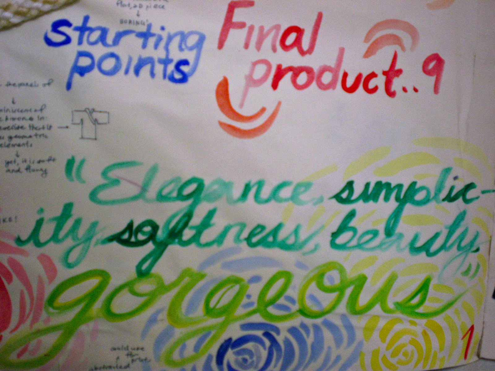
"Elegance, simplicity, softness, beauty, gorgeous"
As you can see in the pictures below, I began to draw out random things in watercolour and annotating the things I liked and would like to use in the project. It was sort of a collage mindmap.

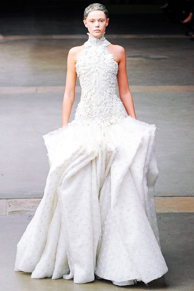
This picture right above of the two models were from the Alexis Mabille collection, in which I really fancied the silhouette of the dresses, being so simplistic yet creating such a wonderful shape, and I really liked the way it draped down and the way the design was so flexible and could be recreated in different ways.

I also liked this design (above) as I call the peacock dress due to the creative use of symmertry in the design and it's also by one of my favourite designers, Alexander McQueen. As you can see in the bottom right hand corner, I was also using watercolour to experiment with painting some roses in an abstract, "leave-only-the-essentials" form. I also randomly painted in the left hand corner some peacock feathers but it was not really a great inspiration for me and I abandoned that idea of the feathers.

As you can see on the picture above, I took another one of Alexis Mabille's designs as inspiration where the petals looked as if they were falling off the dress, giving it this surge of life and movement, and it was really beautiful in that way. Surrounding the picture I also stuck pictures of all these brightly coloured flowers and you could say that they were pretty much my biggest inspirations for this project.

Here, I was talking about how I really liked drapery and the way it softened things. It was more of a side consideration rather than a main inspiration though... And this is my full page of the first page of the sketchbook:

A few theories here and there... Oh and I was also rather interested in the texture of ropes! And I was also very inspired by this dress(if you can see it in the picture) :
I felt that it was something I could emulate because it embodied the angular forms of a kimono through the rectangular panels of cloth. It also really embodied almost exactly what I initially wanted for my project, in terms of the elegance and beauty it had.
My next page would be the start of my experimentation. Here's a full picture of how it looked like:

I was actually intending to incorporate some graphic design into my kimono, so I started to do my own graphic design, but I found that I soon lost touch with it and was not exactly the direction I wanted to go in. Nonetheless, I kept it in the records of my sketchbook just in case I wanted to refer back to it again.
I also experimented with some drapery, though not a lot, because I originally didn't want to use it as a focal point. However, I did come across this interesting technique of printing on fabric, and I tried my original designs on both translucent cloth and opaque cloth. I wanted to see how the colour might be affected by the texture of the cloth and the printer. Here are closeups of the page...


the printing on the fabric...
and the rose on the top is the watercolour design done on paper before being photocopied onto the cloth, which would be the rose at the bottom...

For the next two pages, I was experimenting with printing with ropes, and I created repetitive patterns by tying the rope in random patterns across a waterbottle, and then I continued to paint the surface of the rop and press the bottle with the rope down as I rolled it across paper to form a pattern. Mr Robertson had suggested that I use a piece of wood or some flat surface and then glue the rope to it and do something like printmaking, but I personally did not want to use that method as I was hoping for a repetitive pattern and the watterbottle would serve as a better tool and I felt that it would be very labour intensive by printing the pattern on one at a time.


The next page was my experimentation with making paper flowers! :)
At this point, I was already very keen on making flowers as in a 3-d form as I wanted to emulate the form of the falling flowers coming to life as illustrated in the Alexis Mabille dress. However, I would try to find a way to do it on my own.
Initially I was searching up for methods of doing paper flowers to get me started and I tried to do some of the origami ones but they were just too hard and the tutorials provided were very confusing, but I cam across another tutorial, and I thought "Hooray!" It looked easy enough.
http://dozidesign.blogspot.com/2008/05/paper-flower-tutorial.html
and it was pretty too...

It was actually rather difficult for me to do. If you managed to do it, bless you but don't mock me :)
Anyway, so I started on my own journey, doing my own original, from-scratch paper flowers. I started with the simplest idea: layering.

And yes, the final product of my first attempt as shown above looks pretty lame, but nonetheless, as Thomas Edison said,
"I have not failed. I've just found 10 000 ways that won't work."Same concept. I had just found a way that I was not going to use or would work for my project :)
Anyway, I continued on to do another paper flower by using individual petals from the bottom up, so started with the bottom layer using petals that decreased in size as I built the layers.

In this first picture, I had used superglue to glue the petals together, and it was quite messy but nonetheless, when I dyed the flower, the petals continued to stick together.

However it had one MAJOR flaw. It was just too flat! It did not have the realistic, 3-D pop-up effect I had hoped to achieve. I then realised to make it work, I had to truly follow the structure of a flower closely:

Instead of doing things the "slacker" way I would have to get hardworking with this. I had to do it petal by petal from the core to the outside. Though time-consuming (3hours), I still managed to churn out something I was truly proud for and of.


Here's the full page:

On to the next page!
For the next page, it was mainly about textures.

This page is a little boring I know...
But i was experimenting with the paper textures and I was trying with crumpling the paper, and with mixing the cherry dye with the violet dye, and I know not much difference can be seen, but since I had already painted my paper kimono entirely dark indigo by then , I was using the paper dyeing tests to see if I could incorporate colour and more texture into the paper flowers or if I wanted to use some of teh dyed paper to accessorise the kimono. However, the colours I had used were not very complementary with the kimono colour... But I did notice that the original off-white colour of the paper went very well with the kimono. Oh and the paper I dyed was the same one used for the pages of the sketchbook!

Here's the pic!
Okay moving on, I also experimented with the nylon rope I had...


The two black ropes on the left that you see here are actually tied in this fashion where it's supposed to be a magic trick when tie it all the way and pull the end at which you stopped tying and everything would come out. I thought it was a better alternative to a rgular braid as a braid was very flat and I would have to tie the ends, and it would be very fat and ugly at the ends, so I tried to divert away from using the braid.
I also experimented with different colours of nail polish against the off white background as I was thinking of painting the tips of the paper roses with glitter nail polish so that it would create this magical effect.
The next page would be my designs, which I did entirely in watercolour as it was an easy medium to work with in designing.


1) A sunset gradient from navy to sunset golden-yellow with blue roses of fantasy
2) Purple/indigo with white flowers
3) White background kimono with blue and green abstract rose paintings?


Belt/obi ideas, using drapery and others.
I then came to my final design... which I admit looks really really boring on the sketchbook.


However, my intention behind the plain design was so as not to constrict myself while I was in the process of making it, I mean, the process is just as, if not more important than the final product right?
Unimpressive design I agree, BUT I was really very happy with my actual final product! :)


The front...

I don't have the actual kimono with me now, so I apologise for the low quality pictures :(
But anyway, here's my final concept as well:

And here's my front cover as I promised:


but anyway,

these two are still pretty :) they're like the flower buds, which I also made for the actual kimono so not every flower was in full bloom.
YAY! OKAY SO THAT'S ALL FOLKS! :D
Hey Jub!
ReplyDeletei think your kimono development is really extensive and very detailed. the experimentations are very well structured and shows spontaneity. I personally like the way you worked with texture by the use of braiding string, good work there. Overall i feel the way you introduced various other mediums like fabric in creating a mixed media work was quite effective. especially the drapery for the sleeves. Keep up your passion and interest! ^^
yo jubo! svena here! really liked this work... i didn't actually like my kimono a lot, but seems like you really put in a lot of effort for yours!! which turned out really awesome btw!!! >:D i liked how you really tried to develop the whole thing and experimented with many different themes, which are so nicely captured in this post! not only was the content of your prep overwhelming , but how you presented it was also really thoughtfully and in that authentic jubo style haha!
ReplyDeletegreat job babe~
hey jub! to add on to my previos post i think an AFI would be that perhaps you could lok for some cultural influences in terms of design, such as the traditional motifs if you have interest, and incorporate them in your work. This could make the final product more relatable(:
ReplyDelete